This graph represents temperature anomaly, which is the difference from an established average (here each year's temp is compared to the average from 1970-1999). Where do the majority of the data fall?

Overview
In this lesson, students have graphs that show the compiled data from the data snapshot model in lesson 9. Students compare these to the conclusions they developed using the model. They also use this data to think about the differences by season.
In addition to the data snapshots graphs, there are graphs from GLISA that look at water temperature and lake level trends. They also use this lesson to see the impact of rising temperature on ice cover on the lakes.
Standards
Next Generation Science Standards
- Earth and Space Sciences
- [MS-ESS2-4] Develop a model to describe the cycling of water through Earth’s systems driven by energy from the sun and the force of gravity.
- NGSS Crosscutting Concept
- Patterns
- Energy
- Stability and Change
- NGSS Practice
- Analyzing Data
- Constructing Explanations, Designing Solutions
- Using Models
- Conducting Investigations
Computational Thinking in STEM
- Data Practices
- Analyzing Data
- Collecting Data
- Visualizing Data
- Modeling and Simulation Practices
- Using Computational Models to Understand a Concept
- Constructing Computational Models
- Systems Thinking Practices
- Understanding the Relationships within a System
Credits
ice cover graph: https://www.glerl.noaa.gov/data/ice/imgs/IceCover_avg_1973_2020.png
Activities
- 1. Changes in Temperature by Season
- 2. Precipitation Differences by Season
- 3. Trends in the Great Lakes
- 4. Lake Temperature and Lake Levels
- 5. Ice Cover in the Great Lakes
Student Directions and Resources
The model in the previous lesson allowed you to determine some trends, perhaps in a single city or a single time of year. But, maybe you were frustrated by not being able to see the whole picture. Climate scientists often have to go through a lot of data to determine trends. In this lesson, you will see graphs that have used the data from the model in the previous lesson. There will also be data from other scientific organizations in the Great Lakes, like University of Michigan's Great Lakes Integrated Sciences and Assessments (GLISA).
1. Changes in Temperature by Season
| Season (2000-2018) | Spring | Summer | Winter | Fall |
| Average Temp Anomaly (degrees F) | 0.54 | 0.54 | 1.15 | 0.53 |

Question 1.1
Above 0
Below 0
Below 0
Question 1.2
Which season is increasing in temperature the most?
Spring
Summer
Winter
Fall
Summer
Winter
Fall
Question 1.3
What is something you notice on this graph? Provide specific evidence to support your observation.
2. Precipitation Differences by Season
| Season (2000-2018) | Spring | Summer | Winter | Fall |
| % Average Annual Precipitation | 102.5 | 98.3 | 103.4 | 94.2 |

Question 2.1
Which number is equal to the average annual precipitation?
0%
60%
100%
180%
60%
100%
180%
Question 2.2
In which seasons are the increases in precipitation the greatest? Use at least 3 pieces of evidence from the graph and table.
Question 2.3
What is something you notice on this graph? Provide specific evidence to support your observation.
3. Trends in the Great Lakes
A warmer atmosphere holds more moisture, increasing the frequency and intensity of heavy rain and snow events. Overall U.S. annual precipitation increased 4% between 1901 and 2015, but the Great Lakes region saw an almost 10% increase over this interval with more of this precipitation coming as unusually large events. In the future, precipitation will likely redistribute across the seasons. We expect wetter winters and springs, while summer precipitation should decrease by 5-15% for most of Great Lake states by 2100.
(source: http://elpc.org/wp-content/uploads/2019/03/Great-Lakes-Climate-Change-Report.pdf)
The text above is from the Climate Change Report from the Environmental Law and Policy Center. Use the text along with the graphs on page 1 and 2 to answer the following questions.
Graphs from page 1 and 2:
Question 3.1
Explain what evidence the graphs on pages 1 and 2 provide to support or refute this statement in the Climate Change report. Use specific data from those graphs.
Question 3.2
Based on what you've learned, why do you think precipitation may decrease in the summer?
Question 3.3
Which of the factors in the Great Lakes may be impacted by these changes? How will they be impacted or change?
4. Lake Temperature and Lake Levels
In the 2019 Climate Trends report from GLISA, there is additional focus on lake water temperature and lake water levels. The following graphs show changes from 1950-2019 in the 5 lakes (Michigan and Huron are grouped together).

Retrieved from: (https://glisa.umich.edu/2019-annual-climate-trends-and-impacts-summary-for-the-great-lakes-basin/)
Question 4.1
What does the data indicate is happening to lake water temperature over time? Provide specific evidence from the graphs.
Question 4.2
If you were going to compare lake water temperature to another set of graphs, which one would you choose? Do you think it might be connected? Why?
Question 4.3
Lake water levels are another incredibly important factor. What do the graphs indicate is currently happening to lake levels? Is there a trend over time?
Question 4.4
If you were going to compare lake water levels to another set of graphs, which one would you choose? Do you think it might be connected? Why?
Question 4.5
Ice cover (when the lakes freeze over) is another indicator that is being used when looking at the Great Lakes system. Based on the data you've seen, predict what is happening with ice cover in the Great Lakes (increasing, decreasing or staying the same) and explain your reasoning for your prediction.
5. Ice Cover in the Great Lakes
Ice cover is another indicator and major factor that affects the Great Lakes' seasonal weather patterns. Ice cover is impacted by a number of different factors, and is especially dependent on the location of the jet stream, a band of fast moving air in the atmosphere.
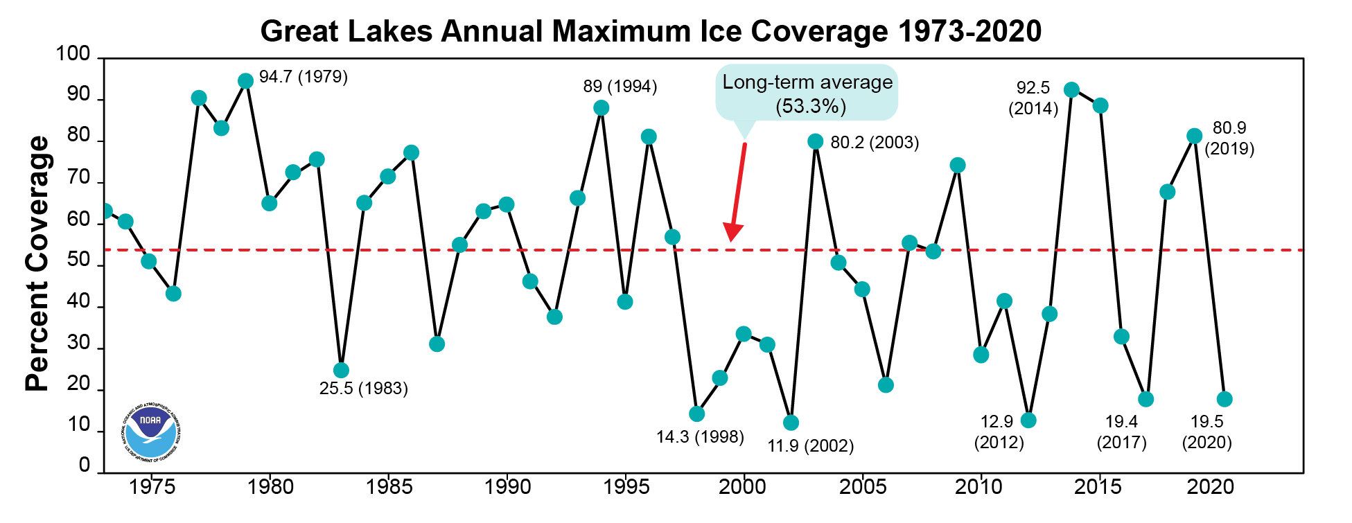
Question 5.1
Count the number of data points above the long term average between 1980 and 2000, and the number above the long term average between 2000-2020. What do you notice?
Question 5.2
From 1975-2020, in which years are the 5 lowest amount of ice cover?
Question 5.3
Your friend tells you that he heard that the ice cover this year is really high. In fact, he heard on the news that it is the highest in 10 years. Given the data you see on the chart, what do you think? Why do you think ice cover is high? Do you think it will continue to stay high in the years following?
Question 5.4
What connection(s) can you make about temperature and precipitation trends you noticed in the maps and the data snapshot model? How might these impact ice cover in the Great Lakes?