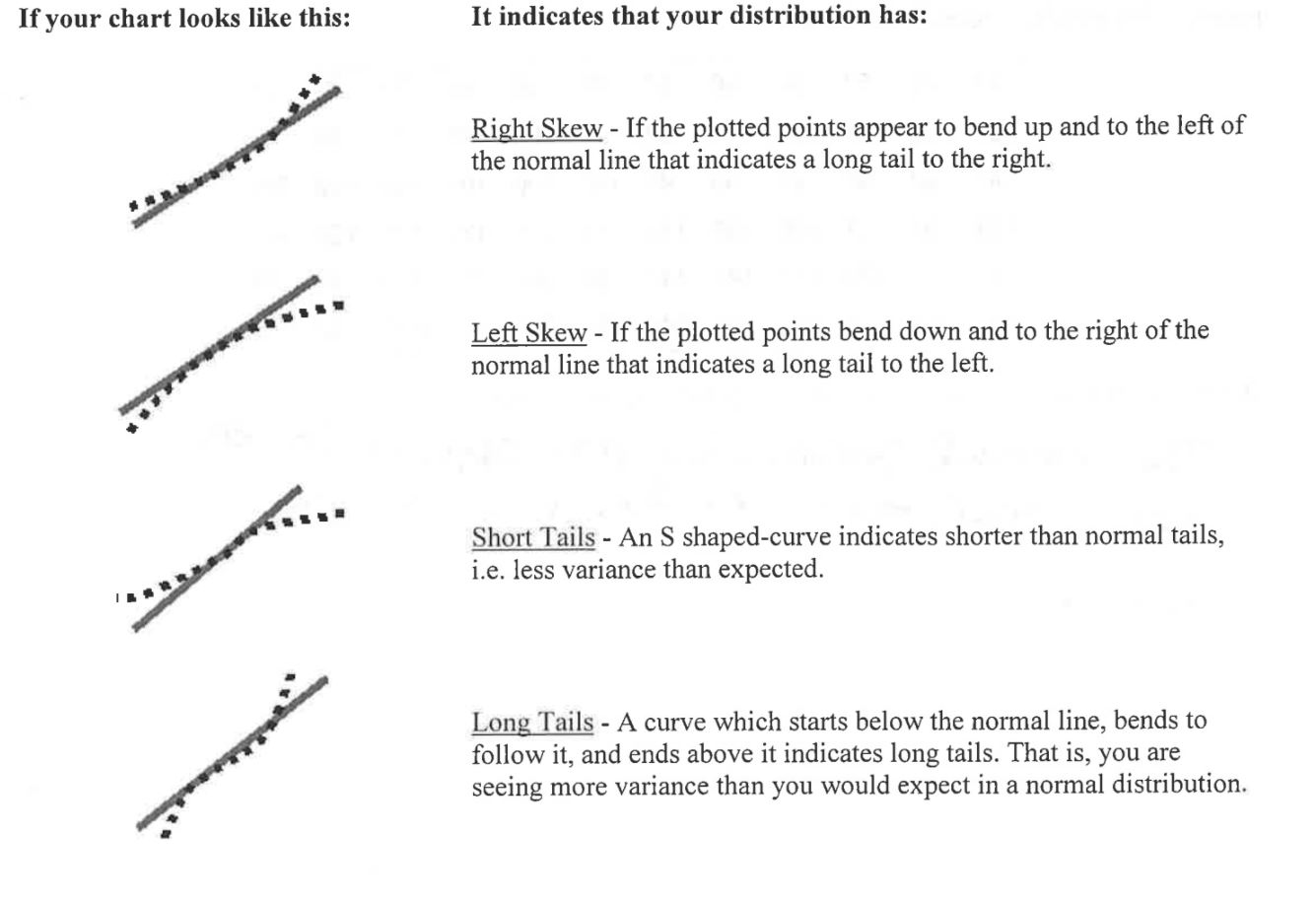
While normal distributions provide good models for some distributions of real data, the distributions of some the common variables are usually skewed and therefore distinctly non-normal. Examples include economic variables such as personal income and total sales of business firms, the survival times of cancer patients after treatment, and the lifetime of electronic devices. It is risky to assume that a distribution is normal without actually inspecting the data, so it is important to check a distribution for normality. You can assess the normality of a distribution by plotting the data using a dotplot, stemplot, or histogram or checking whether the data follow the 68–95–99.7 rule. However, just because a plot of the data looks normal, we can't say that the distribution is normal. For a better assessment of whether a data set follows a normal distribution, we can use a normal probability plot.
To assess the normality of a distribution from its normal probability plot, look at the plotted points, and see how well they fit the normal line. If they fit well, you can safely assume that your process data is normally distributed. If your plotted points don't fit the line well, but curve away from it in places, you may have a non normal distribution.